In the age of data-driven research, data visualisations have emerged and proliferated as indispensable tools for understanding complex phenomena. Visualisations can be compelling. They communicate objectivity, efficiency and authority. However, data visualisations are not neutral. They embody and convey particular epistemological perspectives, shaping how knowledge is produced, circulated and understood (D’Ignazio & Klein, 2020; Ratner & Ruppert, 2019; Williamson, 2016). In scholarship, visualisations are, like other scientific practices, ‘designed to make the invisible visible, the evanescent permanent, the abstract concrete’, and in this sense, visualisations are ways in which scholarship ‘discovers the world anew’ (Daston & Lunbeck, 2011, p. 1).
This article explores the epistemologies inherent in data visualisations when they are produced within critical studies of the datafication of education. It takes up the call for researchers to interrogate the tensions that arise when the ‘digital tools’ we use ‘may harbour concepts and techniques that stand in tension with […] the critical and interpretive traditions in the humanities and social sciences’ (van Es et al., 2021, pp. 46-47). As an entry point to a broader discussion, the paper reflects on the development and use of InfraReveal, a tool that collects and visualises data about the digital infrastructures at work as networked digital resources are used in classrooms. After introducing InfraReveal’s Internet Protocol (IP) data visualisation as an example, this paper considers the role of data visualisation in critical educational research in constructing certainties, geographies, and digitalities.
InfraReveal
As part of the methodology in Reconfigurations of Educational In/Equalities in a Digital World (RED), an international research project, we used InfraReveal to facilitate the analysis and visualisation of the digital infrastructure supporting educational technologies in schools. InfraReveal was developed by the RED team specifically for packet analysis and metadata extraction, enabling us to delve into the inner workings of the infrastructure.1 The InfraReveal tool allowed us to extract and analyse the metadata attached to data packets generated during the use of various school services and internet technologies. By capturing and dissecting this metadata, we could uncover crucial information about the companies involved in providing digital solutions, such as data storage, computation, identification control, and security. This information sheds light on the often unknown actors and the intricate web of services contributing to what most often appears to be cohesive digital experiences in schools.
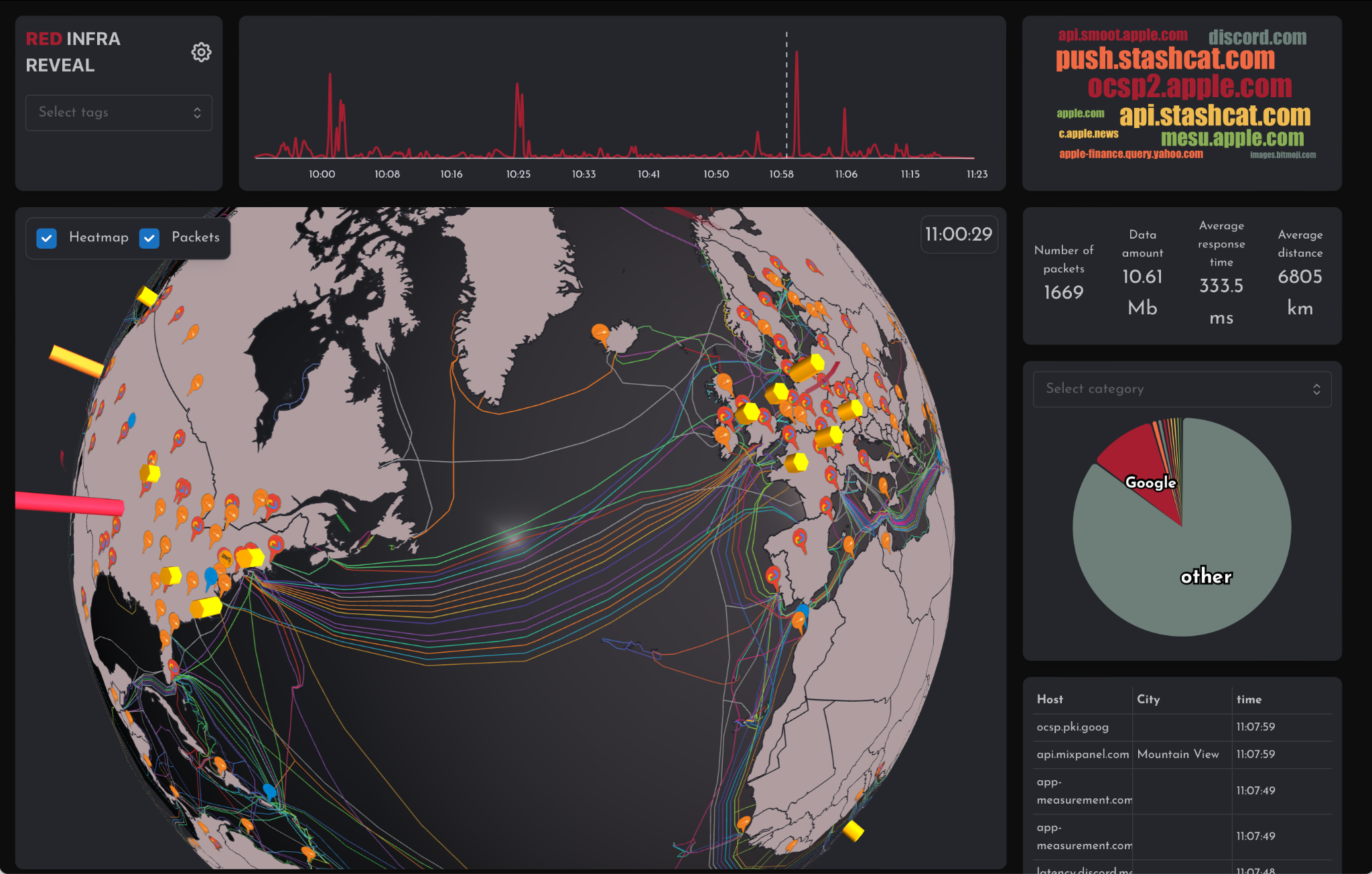
Fig. 1 Data visualisation from InfraReveal
When accessing websites, online media, or digital platforms, a user’s browser or application sends requests to servers for the information needed to display the desired content. At the same time, data from a user’s device is also sent away to servers where it can be collected or acted upon and then sent back or sent forward to other servers where other actions are performed. Regardless of where it is headed, all of this data is transmitted in the form of data packets, tiny portions of data that are reassembled when they reach their destination. Each tiny data packet is labelled with source and destination addresses that are formulated according to a standard scheme known as Internet Protocol (IP). During sessions where InfraReveal is used, the tool acts as an intermediary for these packets, commonly referred to as a proxy server. This approach enables InfraReveal to observe the origins and destinations of data packets, including the precise domain name associated with each packet.
To illustrate this process, imagine sending a book to a friend through the post. You would place the book in an envelope, clearly indicating your friend’s address, your address, and the weight of the package. Under normal circumstances, the book would be dispatched directly to your friend. However, in this case, the envelope is first sent to an intermediary that records the addresses on it along with the weight of the package before allowing it to continue on its way without ever opening it to read the book. For the data packets that are recorded by InfraReveal, the addresses are formulated as IP addresses, and the weight of the book is analogous to available metadata, such as whether a data packet includes part of a text or image file. As a result of collecting the IP addresses and metadata, the tool has no access to the content of the data contained within the packet, but it can not only visualise the geographical origin and end locations involved in the data transmission but also allows for the categorisation and classification of the packets.
As Fig. 1 illustrates, the central part of the InfraReveal dashboard displays a globe. On this globe, the geographical location of the servers with which data packets are sent and received are visualised in real-time as columns. The higher the column, the more data packets have been exchanged with the servers at that location. Live data packet traffic between servers is visualised by arching lines that appear during the time that transmission is occurring. While the columns and lines change over time during a session, several static information features can be shown on the globe if a user chooses. These include callouts in different colours that indicate the company that owns a data centre housing servers at a location and traces of the routes taken by undersea cables through which data is transmitted. The high density of these cables in the North Atlantic can be clearly seen in Fig. 1.
Beyond the central globe visualisation, the InfraReveal dashboard also includes a timeline at the top that visualises the amount of data traffic exchanged over time. To the right of the timeline, a dynamic word cloud displays the Uniform Resource Locators (URLs) for the online services being accessed, scaled by their prominence. Under the word cloud, basic statistics are displayed for the number of data packets exchanged, the amount of data contained in those packets, the average time it has taken for those packets to travel, and the average distance travelled. Under those numbers, a circle diagram displays the proportion of data packets that have been exchanged with servers in different categories. The categories shown can be chosen by the user and include the company that owns a server and the type of service performed by that company. Finally, lowest down on the right side is a dynamic table showing information about the exchanged data packets, including the ‘host’ or server URL, the city the server is located in, and the time at which it was exchanged.
Producing Certainties
Certainty is a key characteristic associated with data visualisation, as it often presents complex information in simplified forms that provide conclusive insights (see Brodlie et al., 2012). Visualisation, especially real-time visualisation, thus feeds the ‘utopia of certainty’ with the associated ‘promise of guaranteed outcomes’ that has been diagnosed for today’s datafied world (Zuboff, 2019, p. 398, 497). Research has outlined how the visualisations in educational technologies tend to operate with clearly demarcated colours (e.g., traffic light colours to mark success and failure), bar charts, and circle diagrams (Jarke & Macgilchrist, 2021). Similarly, the data visualisations in educational research also tend to deploy clearly coloured and persuasive images. When data visualisations strive in this way for clarity, they may inadvertently mask the inherent uncertainties in the underlying data. Clarity masks the ways in which researchers engage in ‘data cleaning’, i.e., identifying, correcting and/or deleting the absences, inaccuracies, indeterminacies and other frictions in the underlying datasets (Ratner & Ruppert, 2019, pp. 11-12).
However, the (im)possibility of visualising uncertainty poses a critical challenge. Even if we assume that knowledge generation is inherently uncertain, open-ended and indeterminate (Biesta, 2013; Allert et al., 2017), visualising this epistemological position can lead to overly complex images that users find difficult to understand (Ratner & Bundsgaard, 2017). Designers, policy-makers, scholars and others have thus explored ways of visualising uncertainty, for instance by including confidence intervals. In Visualising Uncertainty: A Short Introduction, for instance, Polina Levontin and colleagues explore bar charts with aesthetic error bars, box plots with whiskers to represent the error margin, and how to utilise different shapes, shades, curvatures, densities or saturation to illustrate uncertainty in beautiful ways (see Levontin et al., 2020). Climate science, healthcare and national defence bodies have all experimented with visualising uncertainty in their domains (Macgilchrist & Jarke, forthcoming). Nevertheless, visualising uncertainty—in all walks of life—can be destabilising and stressful (Walker et al., 2022).
In the case of InfraReveal, geolocations generated from IP network data provide approximate guesses of origin and end locations (the yellow, orange and red markers in Fig. 1). When these are presented as definitive information, this creates an illusion of certainty and suggests that data packets travel in a clean one-directional journey. This representation reduces, for instance, the complexities of data packet ‘hops’, where a number of intermediary devices are involved until a data packet reaches the destination. Additionally, when the ‘numbers of data packets’ are shown as specific numbers (1669 in Fig. 1), this suggests no data packets have been ‘lost’ or misidentified. When a category such as ’Google’ is included, this suggests that all Google and nothing but Google is included in the red section of the circle diagram, and that no Google is included in the other coloured chunks of the chart. However, Google uses many IP addresses and diverse URLs to label the millions of servers it operates, and while the categorisation may be reasonably accurate, it is not able to capture all the nuances of the intricacies of all of Google or any other major technology company’s infrastructure. Added to this, many large technology companies provide a multitude of different services, so while it is possible to categorise traffic exchanged with a specialised company such as CrowdStrike, which provides security services, identifying the security services provided by a company like Amazon is more difficult. Echoing discussions that ‘generative AI’ should be flagged as such, to make the process of text/image-generation more transparent, we decided in InfraReveal not to visualise error margins or the complexities of data packet traces, but instead to flag the uncertainty in a textual disclaimer on the website and to discuss the issue during workshops in which the tool is used. Acknowledging and addressing the limitations and uncertainties of data visualisation is crucial for a more nuanced and reflexive representation of complex phenomena.
Producing Geographies
Geographic dominance is another common aspect of data visualisation, especially those involving maps. Cartography is always shaped by the dominant political, social, cultural and economic forces of its time. Some maps reproduce these forces, as in the West’s most common world map, the Mercator projection, which shows correct local directions and shapes yet enlarges the countries further from the equator (e.g., Europe, USA, Canada, Russia, Australia). Other maps contest these forces, such as Peters World Map, which shows the correct proportions of countries in relation to one another and thus loses the shapes; other radical cartographies show, for instance, south at the top of the image (Kollektiv orangotango+, 2018). As critical geographers have long noted, maps are selective representations of the world, imbued with power and politics. Thus, ‘in taming and making sense of the world’s infinite complexity, every map has its own particular and subjective story to tell’ (Graham & Dittus, 2022, p. 11). These stories include design choices about what to include and what to exclude, where to draw lines and how to simplify relations.
On a more basic level, the stories told by maps also render the things being visualised as spatial in the first place. While geographic maps are visually powerful and easily relatable, the desire to make everything locatable can lead to an overemphasis on geographic representations despite the fact that not all data are inherently spatial. Forcing non-spatial data into geographical contexts may distort underlying information and obscure important insights. In addition, geolocations are fallible. As Madisson Whitman notes about data practices that utilise WiFi network logs as a proxy for behaviour that can predict students’ risk of dropping out, when she compared her personal account of her location on campus, and compared this to the network logs, she ‘consistently found chunks of missing time, incorrect geolocations and overall an inaccurate picture of [her] time on campus’ (Whitman, 2020, p. 9). Recognising the contextual relevance of geographies and questioning the necessity and function of location-based visualisations are essential to avoid the imposition of spatial biases and promote more meaningful representations of data.
InfraReveal, for instance, is visually organised around a central map. Although the team generally presents the project members’ locations with a Peters projection map showing south at the top, for InfraReveal, the more widely recognised Mercator projection was chosen. This was in part to avoid information overload since InfraReveal is already presenting a lot of non-standard information. In this way, InfraReveal reproduces the traditional onto-epistemologies of the Global North. It simultaneously aims to undercut these same onto-epistemologies by visualising geographic data inequalities between global regions. With this goal, the RED team decided to create a location-based visualisation in order to show overall patterns in the data centre locations. Although these patterns are fallible, a replay of one of the InfraReveal sessions in Mexico, for instance, visualises the overarching pattern in which the large majority of data packets travel primarily to the US and Europe, with barely any data centres in Mexico or elsewhere in the Global South.2 As a project, we live with the tensions of reproducing dominant geopolitical relations while simultaneously trying to visualise these relations as problematic.
Producing Digitalities
These certainties and geographies were produced within a participatory design approach. This kind of co-design process can — scholars and practitioners hope — produce just data visualisations that are meaningful and supportive for users with diverse needs (e.g., Walker et al., 2022). In our research process, we particularly noticed the tensions of participatory approaches in the way that InfraReveal produces localised digitalities. For research which aims to make sense to users across global settings, a key challenge is that the conditions for participation in the development of visualisation techniques vary across local contexts. How schooling is seen, and how teachers understand their professional identity varies across geographic, political and cultural settings. Similarly, what appears to be ‘common sense’ in the use of digital technology varies across these settings.
A core challenge of participatory approaches is thus how to invite and include a suitably diverse range of (potential) participants and users. Hackathons, for instance, ostensibly aim to be open and inclusive. Nevertheless, the announcements implicitly address entrepreneurial, optimistic people to join as participants in creating technical solutions to social problems, thus uninviting people who believe that social problems require structural solutions (Krämer & Trischler, 2023). Projects taking deliberate steps to include participants usually underrepresented in decision-making processes, such as students declaring Indigenous status in Australia, in their university’s decisions about how to use data-intensive analytics systems, constantly reflect on how inclusive their practices are, on the power dynamics of the participatory process, and on how to keep ensuring participation beyond tokenism (Buckingham-Shum, 2022).
Developed as part of an international project involving fieldwork in five countries in three global regions, InfraReveal was also conceived of as a participatory development process. However, for practical purposes, the participatory process was developed with teachers in southern Sweden. What makes sense in one locality may not necessarily yield the same outcomes in other regions or countries. For instance, the approach developed with these teachers thrived in our project schools in cities in Sweden, in Buenos Aires and in some locations in South Africa, yet encountered challenges when used with some partner schools in northern Germany, South Africa and urban and rural locations in Mexico. This was partly due to similarities and variations in local norms about teaching and learning and different provision of technological infrastructure. It was also due to factors such as the histories of relations between researchers and educators, over-researching of schools, segregated school systems, rural/urban distinctions, curricular and assessment pressures, levels of formality in schools, and histories of political surveillance. InfraReveal’s data visualisations thus inadvertently produced an understanding of digitality that resonated in some schools in some regions more than in other schools in other regions. Understanding the situated nature of participatory development and digitality allows for more contextually appropriate and inclusive data-visualisation practices.
Concluding Thoughts
Creating data visualisations means making design decisions. These design decisions are constitutively entangled in politics and power relations. The data visualisations created in InfraReveal aim to enable ‘new’ ways of ‘seeing’ the data practices underlying everyday uses of networked digital technologies in education. The ultimate goal is to explore if and how inequalities are being reproduced or newly fashioned in educational practices, i.e., to explore potential global data inequalities. With this approach, we aim to bring a critical, reflexive attitude from humanities and social science into our work with computational techniques and data science methods. In this way, the project team grapples with the tensions inherent in critical research that draws on the histories of design decisions that were originally made with very different goals. In this case, InfraReveal builds on the technologies of data packet tracing that were originally intended to help technicians diagnose faults and security issues.
By critically examining the way data visualisations produce certainties, geographies and digitalities, this article has sought to shed light on the epistemological—and thus also political—implications of data visualisation. Addressing the (im)possibility of visualising uncertainty, questioning geographic dominance, and acknowledging the localised nature of participatory processes of developing digital tools is crucial for advancing the field of data visualisation and promoting more nuanced and responsible ways of producing and interpreting visual representations of data. A reflexive and critical approach to data visualisation means, we suggest, grappling with rather than attempting to overcome or negate the often unavoidable tensions involved in visualising data. This helps researchers navigate the complexities and limitations inherent in the visual representation of knowledge, ultimately contributing to a more nuanced, contextually appropriate, and inclusive understanding of the world.
Acknowledgements
We thank all the teachers and students who have actively participated in the development and use of InfraReveal in schools in Argentina, Germany, Mexico, South Africa and Sweden, along with the members of the RED project who have each contributed. In particular, we would like to thank Research Engineer Sebastian Andreasson for his extensive work to make InfraReveal possible. This research was possible thanks to the generous support of the Riksbankens Jubileumsfond, which funds the project RED (Reconfigurations of Educational In/Equalities in a Digital World) (GI19-1500). We are grateful to the RED team for our continuous conversations on datafication, schooling, and inequalities.
References
Allert, H., Asmussen, M., & Richter, C. (2017). Formen von Subjektivierung und Unbestimmtheit im Umgang mit datengetriebenen Lerntechnologien – eine praxistheoretische Position. Zeitschrift für Erziehungswissenschaft, 21(1), 142-158.
https://doi.org/10.1007/s11618-017-0778-7
Biesta, G. (2013). The beautiful risk of education. Paradigm.
Brodlie, K., Allendes Osorio, R., & Lopes, A. (2012). A review of uncertainty in data visualization. In J. Dill, R. Earnshaw, D. Kasik, J. Vince, & P. C. Wong (Eds.), Expanding the Frontiers of Visual Analytics and Visualization (pp. 81-109). Springer.
https://doi.org/10.1007/978-1-4471-2804-5_6
Buckingham Shum, S. (2022). The UTS “EdTech Ethics” deliberative democracy consultation: Rationale, process and outcomes. University of Technology Sydney.
https://cic.uts.edu.au/projects/edtech-ethics/
Daston, L., & Lunbeck, E. (Eds.). (2011). Histories of scientific observation. University of Chicago Press.
D’Ignazio, C., & Klein, L. F. (2020). Data feminism. MIT Press.
Graham, M., & Dittus, M. (2022). Geographies of digital exclusion: Data and inequality. Pluto Press.
Jarke, J., & Macgilchrist, F. (2021). Dashboard stories: How the narratives told by predictive analytics reconfigure roles, risk and sociality in education. Big Data & Society, 8(1), 1-15.
https://doi.org/10.1177/20539517211025561
Kollektiv orangotango+ (2018). This is not an atlas. Transcript.
Krämer, H., & Trischler, R. (2023). Designing postdigital futures—The case of hackathons. Postdigital Science and Education.
https://doi.org/10.1007/s42438-023-00412-w
Levontin, P., Walton, J. L., Kleineberg, J., Barons, M. J., French, S., Aufegger, L., McBride, M., Smith, J. Q., Barons, E., & Houssineau, J. (2020). Visualising uncertainty: A short introduction. Sussex Humanities Lab.
https://spiral.imperial.ac.uk/bitstream/10044/1/80424/2/VUI_221219.pdf
Macgilchrist, F., & Jarke, J. (forthcoming). Visualising (un)certainty in datafied education.
Ratner, H., & Bundsgaard, J. (2017). Big data i folkeskolerne er både nyttige og farlige. Information (5 Sept 2017).
https://www.information.dk/debat/2017/09/big-data-folkeskolerne-baade-nyttige-farlige
Ratner, H., & Ruppert, E. (2019). Producing and projecting data: Aesthetic practices of government data portals. Big Data & Society, 6(2), 1-16.
https://doi.org/10.1177/2053951719853316
van Es, K., Schäfer, M. T., & Wieringa, M. (2021). Tool criticism and the computational turn. A “methodological moment” in media and communication studies. Medien & Kommunikationswissenschaft, 69(1), 46-64.
https://doi.org/10.5771/1615-634x-2021-1-46
Walker, K., Potter, E., Hwang, I., Dwyer, T., Egerton-Warburton, D., Joe, K., Hutton, J., Freeman, S., & Flynn, D. (2022). Visualising emergency department wait times; Rapid iterative testing to determine patient preferences for displays. medRxiv, 2022-03.
https://doi.org/10.1101/2022.03.30.22273211
Whitman, M. (2020). “We called that a behavior”: The making of institutional data. Big Data & Society, 7(1)., 1-13.
https://doi.org/10.1177/2053951720932200
Williamson, B. (2016). Digital education governance: data visualization, predictive analytics, and ‘real-time’ policy instruments. Journal of Education Policy, 31(2), 123-141.
https://doi.org/10.1080/02680939.2015.1035758
Zuboff, S. (2019). The age of surveillance capitalism: The fight for a human future at the new frontier of power. Profile Books.
Recommended Citation
Hillmann, T., Macgilchrist, F., & Kiesewetter, S. (2023). Epistemologies of data visualisations: On producing certainties, geographies and digitalities in critical educational research. On Education. Journal for Research and Debate, 6(18).
https://doi.org/10.17899/on_ed.2023.18.3
Do you want to comment on this article? Please send your reply to editors@oneducation.net. Replies will be processed like invited contributions. This means they will be assessed according to standard criteria of quality, relevance, and civility. Please make sure to follow editorial policies and formatting guidelines.
- InfraReveal can be accessed here, including instructions on how to implement it in one’s own projects (no cost): https://infrareveal.net/. More on the RED project can be found here: https://www.edu-digitalinequality.org. ↵
- Replays of sessions from different locations, including Mexico, are available to view on the website: https://infrareveal.net/. ↵
